Atheism, HDI, GDP per capita and Life Expectancy:
A small multiples of scatter plots
Click to hide/show:
How to read this visualization
This small multiples of scatter plots has the data of 100 countries regarding 4 variables: Atheism (in percentage), Human Development Index (HDI, from 0 to 1), GDP Per Capita (in US dollars) and Life Expectancy (in years).
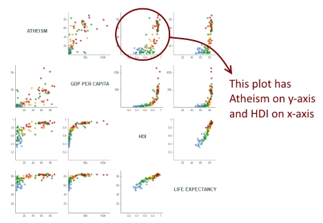
Each “cell” is a scatter plot with 2 variables (one in the x-axis and the other in the y-axis). This gives us 16 scatter plots, but I replaced those 4 where the x and y-axis variables were the same with the name of the variable. This allows you to easily recognize the variable on each axis. Let's take the variable HDI, Human Development Index, for instance:
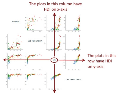
Given a variable, all the plots it its row have that variable on y-axis, and all the plots in its column have that variable on x-axis. Therefore, it’s easy to determine the x and y variable of each plot:
You can hover over each circle to see the name of the country and its two variables for that particular plot. The color of each circle indicates the continent of that country. Click on the boxes on top left to show or hide a particular continent.
How I made this visualization
On the technical side, this visualization was very fun to create and relatively simple. In most of examples found on the web, small multiples are made appending several SVGs, each one containing one chart. In my past “small multiples” visualization, I tried a different approach, appending only one SVG and creating several <g> elements, and appending the drawings inside each <g>. But, for this visualization, I decided to create just one SVG without any group element! So, how to do it?
It’s quite simple. First, knowing that I’d have a 4x4 matrix, I create some “cells” using D3 scales:
var xGrid = d3.scale.ordinal()
				.rangeBands([ outerPadding[3], w - outerPadding[1]])
				.domain(d3.range(0, criteria.length));

var yGrid = d3.scale.ordinal()
				.rangeBands([ outerPadding[0], h - outerPadding[2]])
				.domain(d3.range(0, criteria.length));
Then, it was simply a matter of creating two loops, an outer loop for the rows and an inner loop for the columns:
var criteria = ["atheism", "gdpPerCapita", "hdi", "lifeExpectancy"];

for (var i = 0; i < criteria.length; i++){
	for (var j = 0; j < criteria.length; j++){
		draw(criteria[j], criteria[i], j, i);
	}
}

function draw(xVariable, yVariable, xCell, yCell){
	//draws each plot
}
And positioning each plot according to xCell and yCell:
var xScale = d3.scale.linear()
				.range([xGrid.range()[xCell] + innerPadding[3], xGrid.range()[xCell]
					+ xGrid.rangeBand() - innerPadding[1]])
				.domain([0, d3.max(data, function(d){
					return +d[xVariable] * 1.1;
				})]);

var yScale = d3.scale.linear()
				.range([ yGrid.range()[yCell]
					+ yGrid.rangeBand() - innerPadding[0], yGrid.range()[yCell]
					+ innerPadding[2]])
				.domain([0, d3.max(data, function(d){
					return +d[yVariable] * 1.1;
				})]);
I think that using just one SVG and no <g> inside it is a simple and effective approach.
Source of all the data: Wikipedia.