Normalize your choropleths!
Many geographic profile maps are really just population maps! Let’s look at an example: the GSP (gross state product, in millions of dollars) of all U.S. states are displayed below, where a pale colour indicates a state with a low GSP and a dark colour a state with a high GSP. Why is the GSP higher in California, Texas, New York and Florida? Here is a hint: Do you know which four states have the highest populations? California, Texas, New York and Florida!
This “GSP map” is actually a population density map! You can easily see this by clicking on "Population". Did you see? Almost no difference! Now, click on "GSP per capita".
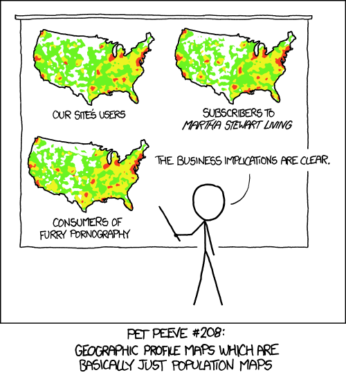
Do you see the difference? Now we have a better GSP map, not a population density map. Perhaps the best way to sum it all up is with this joke from xkcd.com:

PS: I eliminated DC from the map on purpose: there is too much money there, it was an outlier ruining my beautiful colour scale. GSP values for 2009. Source: Wikipedia
Created by Gerardo Furtado.